ClickHouse
18s Product Sizzle
An 18-second product sizzle for ClickHouse Cloud. Speculative, music-led, built to sell speed, scale, and reliability fast enough that someone hits Start Free Trial.
What this is
This is an 18-second product sizzle for ClickHouse Cloud.
Not a demo. Not a UI walkthrough. Not a feature tour with a voiceover explaining every panel.
It’s a short, music-led acquisition spot. The job is simple: make speed, scale, and reliability feel real in under twenty seconds, then land on Start Free Trial.
I made this as speculative work. No paid brief from ClickHouse. Just a bet that a sharp top-of-funnel asset, done in their visual language, is still worth making.
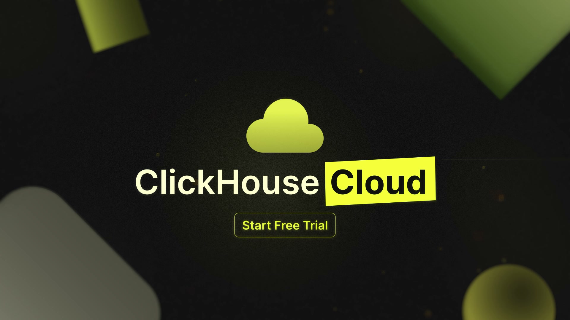 End-card lockup: ClickHouse Cloud + Start Free Trial. Conversion is the point of the previous seventeen seconds.
Why an 18-second sizzle
B2B products this technical often get explained like textbooks.
That’s fine for the middle of the funnel. It’s the wrong tool for the first five seconds of someone’s attention on LinkedIn, a booth screen, or a homepage hero.
A sizzle is different. It doesn’t teach. It frames.
You’re answering one question only: should I care enough to click?
If the answer is yes, longer assets (explainers, demos, case studies) get to do their job later. This piece is the door, not the house.
What the film actually sells
The cut tracks ClickHouse Cloud’s real positioning almost beat for beat.
I pulled claims and metaphors from how they already talk about the product: elastic scale, multi-cloud, uptime confidence, instant insights, integrations, simple/serverless, then brand + trial.
| Beat (approx) | On screen | Product idea |
|---|---|---|
| 0-2s | Neon line → memory markers + Elastic Scaling | Compute that can grow with load |
| 2-4s | Google Cloud + Azure + AWS tiles | Multi-cloud managed service |
| 4-6s | Green bar stack (Blender) → Uptime 99.99% | Reliability as a gut feeling |
| 6-8s | Instant → Insights | Real-time analytics promise |
| 8-11s | Integration mesh → Powerful Integrations | Ecosystem / ClickPipes-style ingest |
| 11-13s | Simple → Serverless | Low-ops managed experience |
| 13-16s | Cloud mark builds → ClickHouse Cloud + CTA | Brand + free trial |
| 16-18s | Yellow mark hold | Brand sting |
The arc:
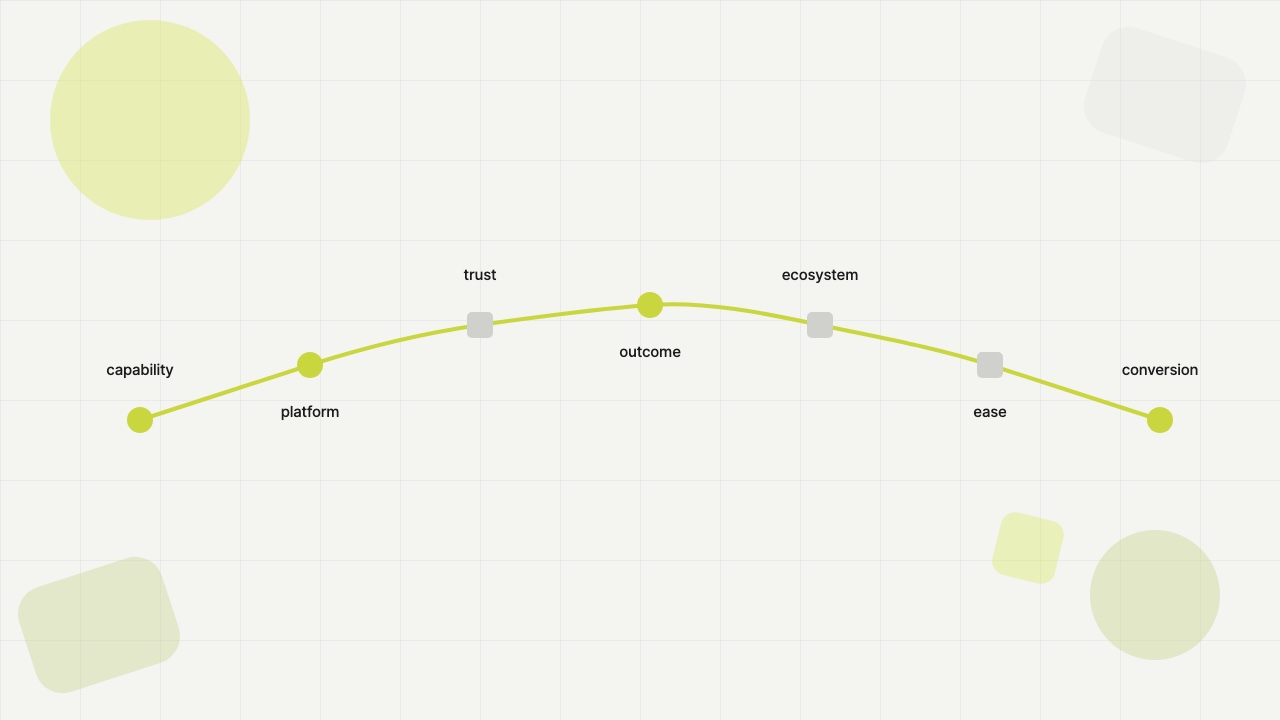 capability → platform → trust → outcome → ecosystem → ease → conversion
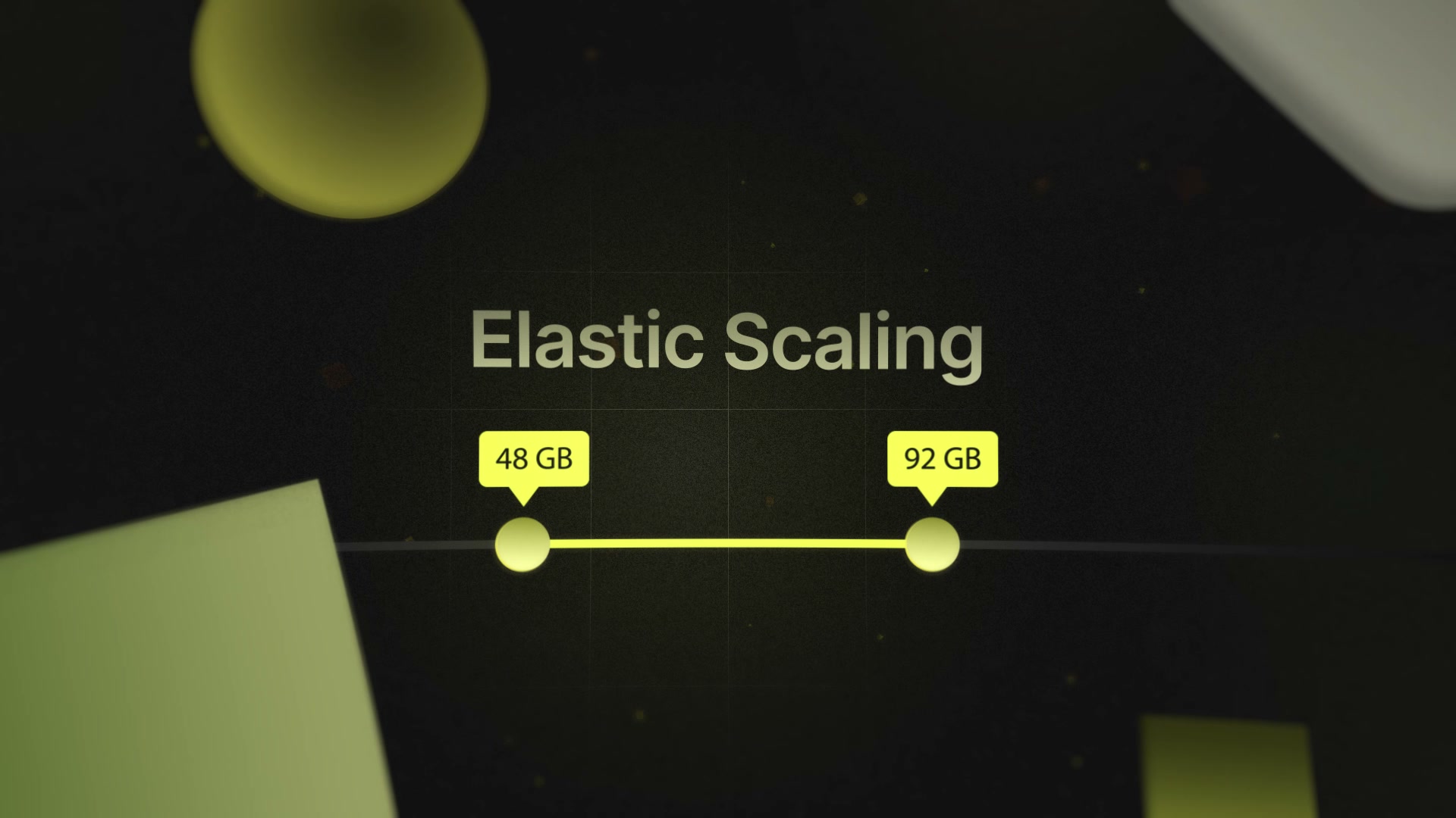 Elastic Scaling: memory markers and the “grows with load” open.
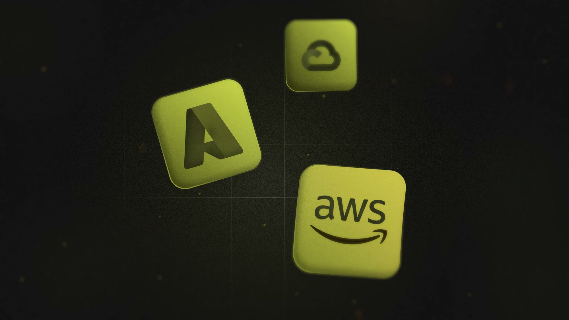 Multi-cloud tiles: Azure and AWS on the dark grid.
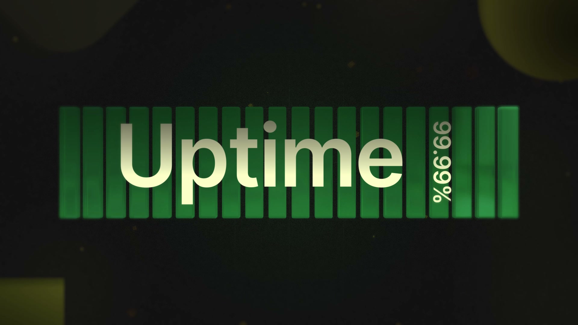 Uptime 99.99%: green bar stack (animated in Blender) as the trust beat.
A quick note on the product
ClickHouse is an open-source analytical database. ClickHouse Cloud is the managed, serverless version of that story: real-time analytics without you babysitting clusters.
A few things that are real and worth naming:
- Multi-cloud. Available across major clouds (AWS, Google Cloud, Azure).
- ClickPipes. Managed ingestion on ClickHouse Cloud. Connect sources and keep data flowing without building your own pipeline ops theater.
- Serverless / managed. The pitch is less infrastructure drama, more “run analytics.”
About the 99.99% line in the film: that’s claim language that shows up in reliability marketing. ClickHouse Cloud’s published service-level agreement is framed around 99.9% monthly availability for credits. In the sizzle, “uptime” is doing emotional work (this thing stays up), not standing in for legal fine print. I keep that distinction on purpose.
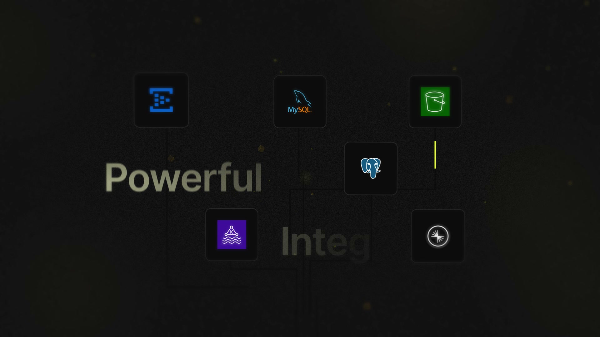 Integrations mesh: MySQL, Postgres, object storage, and friends. The “plug into what you already run” beat.
How I approached it (short version)
Two tracks. Same destination.
Most of the film went Sketch → Illustrator → After Effects → Premiere Pro. Goodnotes sketches first, then Illustrator for the real objects (type, tiles, brand shapes). Overlord into After Effects for motion, depth, glows, particles. Final sequence and music lock in Premiere.
Some assets took a 3D detour. The green bar stack in the 99.99% uptime scene was built and animated in Blender, then brought into After Effects for composite with the rest of the world, then into Premiere with everything else.
So it isn’t one straight line. It’s a 2D system path and a Blender path that meet in AE, then get cut together.
Pinterest was the mood board. Dark UI field, acid yellow, green accents, grid and particles. Infra brand, not consumer soft-glow.
The deeper value isn’t the tool stack. It’s that the film is modular enough to reuse. More on that below.
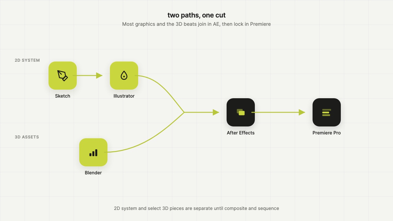 Two paths: Sketch → Illustrator into AE, and Blender into AE. Both lock in Premiere Pro.
 Opening strip from the frame sample: line into elastic scale into early cloud tiles.
Where an asset like this actually lives
Think distribution, not just “post on social.”
Organic and paid social
LinkedIn is the natural home for this audience. Short vertical-friendly cutdowns can travel on other feeds, but LinkedIn is where B2B buyers already scroll in work mode.
Website
Hero loops. Landing pages for free trial. Paid-traffic landing pages where the first frame has to earn the scroll.
Events
Booth screens on a silent loop. Pre-roll before a talk or demo. Hallway / sponsor reels. Trade-show attention is brutal. 18 seconds with no VO is a feature, not a bug.
Sales intros
A cold open before a deck or a product tour. “Here’s the feeling of the product” before “here’s the architecture.”
Same master. Different rooms.
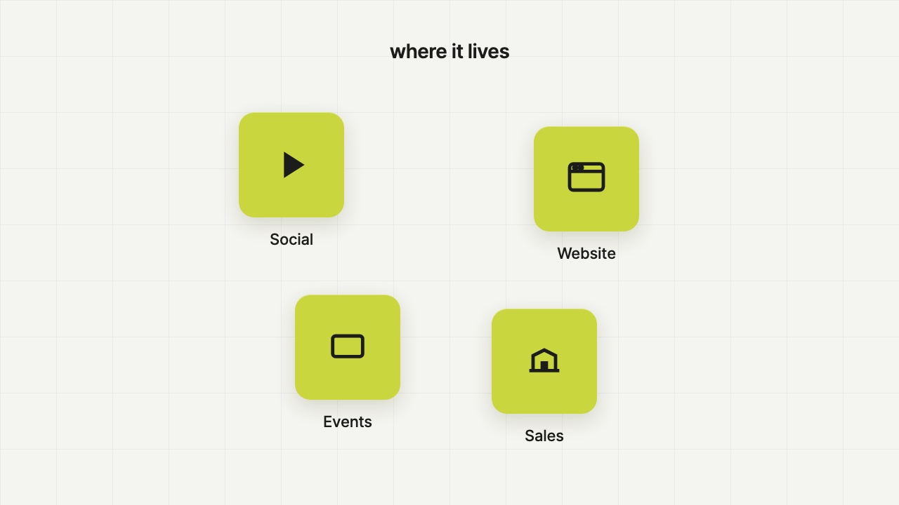 Social, web, events, sales. One master cut, four rooms.
What happened when I posted it
I ran this organically on my own LinkedIn. No ad budget, no company page boost.
Raw view counts on a personal account never look huge. The ratios are what matter, so those are what I’m showing:
| Signal | Rate |
|---|---|
| Avg. watch-through | ~94% of the full 18s runtime |
| Impressions → video views | ~31% |
| Reactions (vs impressions) | ~3.4% |
| Saves (vs impressions) | ~0.8% |
The one I care about most is watch-through.
Nearly the full runtime, on average. People mostly stayed. That’s rare for product motion, especially on a personal feed with zero paid push.
Engagement wasn’t empty either. Reactions and saves both showed up as a real share of people who actually saw the post, not just a dead scroll-by.
The useful takeaway: the cut holds attention end-to-end. That’s what you want to know before you put money behind a sizzle.
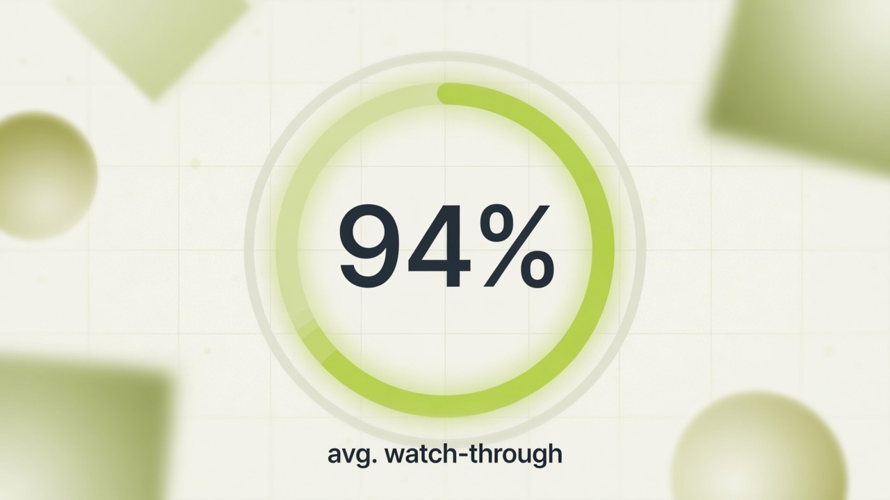 ~94% average watch-through on an 18s film. The number that actually matters.
 The organic post. Screenshot as of AUG10-26
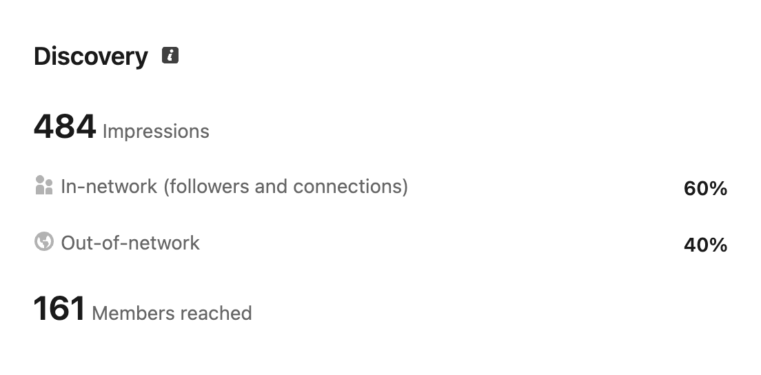 Discovery: impressions and reach split.
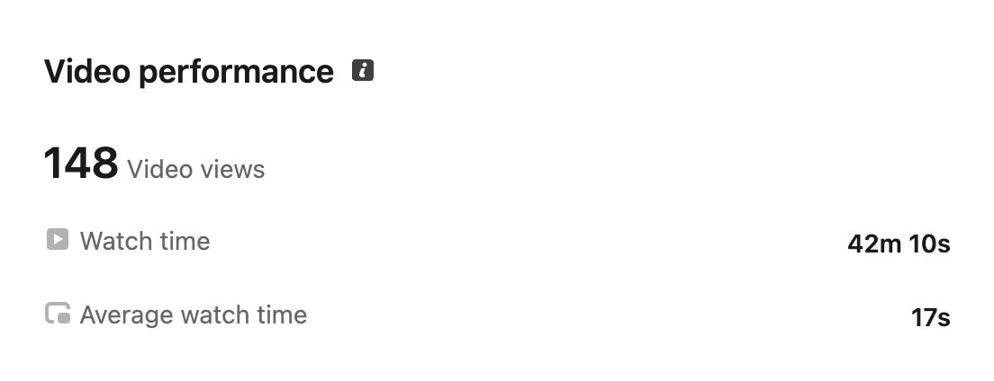 Video performance: views, total watch time, average watch time (17s on an 18s cut).
How to think about paid potential
No invented trial counts. No fake media plan.
Top-of-funnel video is usually judged on attention → click → trial (or lead). CTR is a middle step. Cost per trial is the metric that actually matters.
LinkedIn is expensive compared to broad consumer platforms. Industry benchmarks for Sponsored Content often land in a roughly high-twenties to mid-fifties CPM range depending on targeting and competition, not a few dollars. Your real number depends on audience, creative, and bid strategy.
What this cut already shows:
- It can hold attention organically.
- Paid would buy volume on top of that retention, not invent retention from scratch.
- The CTA is already built in (Start Free Trial), so the creative is conversion-shaped, not just pretty.
A simple check if you’re considering something like this for your own brand: would you put spend behind the last three seconds? If yes, the sizzle is doing its job.
The modular play
An 18-second sizzle is not a dead end. It’s a kit.
Once the system exists (elastic scale graphic, cloud tiles, uptime bars, integration mesh, type treatments, glows, transitions), you can pull pieces out and rebuild:
- 15s / 6s cutdowns for paid
- 90s explainers that reuse the same motion language
- 3-minute demos that open with the sizzle energy, then settle into product UI
- Looping event versions with or without the end card
- Still frames for ads, thumbnails, and sales decks
That’s cost efficiency with a creative upside: everything still feels like one brand, because it is one system.
For a data platform, that consistency matters. Buyers see you in six places. If the motion language drifts every time, you look like five different companies.
 Mid-film strip: integrations into simple / serverless. The pieces that recombine for cutdowns and longer explainers.
 Closing strip: brand build into trial CTA into mark hold. Same kit, different cut lengths.
Who this kind of asset is for
Beyond ClickHouse specifically, this shape of work fits teams selling:
- Managed real-time analytics / OLAP
- Streaming databases and continuous query platforms
- Data infrastructure and observability tools
- Developer-led products that still need a non-technical first impression
If your product is fast, technical, and easy to over-explain, a sizzle is often the missing layer between “we have a great docs site” and “someone who is not an engineer still gets why this matters.”
What I optimized for
Clarity over cleverness.
Every beat is one idea. Scale. Clouds. Uptime. Insights. Integrations. Simple. Brand.
Feel over feature dump.
No SQL editor chrome. No dashboard tour. Music and motion carry energy that a VO would usually force.
Conversion as a design problem.
The end card isn’t decoration. Logo + trial is the point of the previous seventeen seconds.
Brand fit.
Dark field, yellow signal color, tech-grid energy. Close enough to their world that it reads like product film, not a generic template.
The result
An 18-second, music-led product sizzle for ClickHouse Cloud.
Built as speculative work, but structured like a real acquisition asset. Light enough for social and events. Specific enough that the product story stays true.
Not animation for its own sake. A top-of-funnel tool. The organic watch-through suggests the pacing and claims land.
Links
- Main LinkedIn video: https://lnkd.in/p/ga8jg8fU
- BTS: https://lnkd.in/p/g_TpjDb6